50% OFF LAST CALL PILLOWS SHOP NOW
10% OFF with Code: 'WELCOME10' For First Time Customers
How a Color Swatch Box Simplifies Interior Design Decisions
The Beauty of Simplified Design Choices
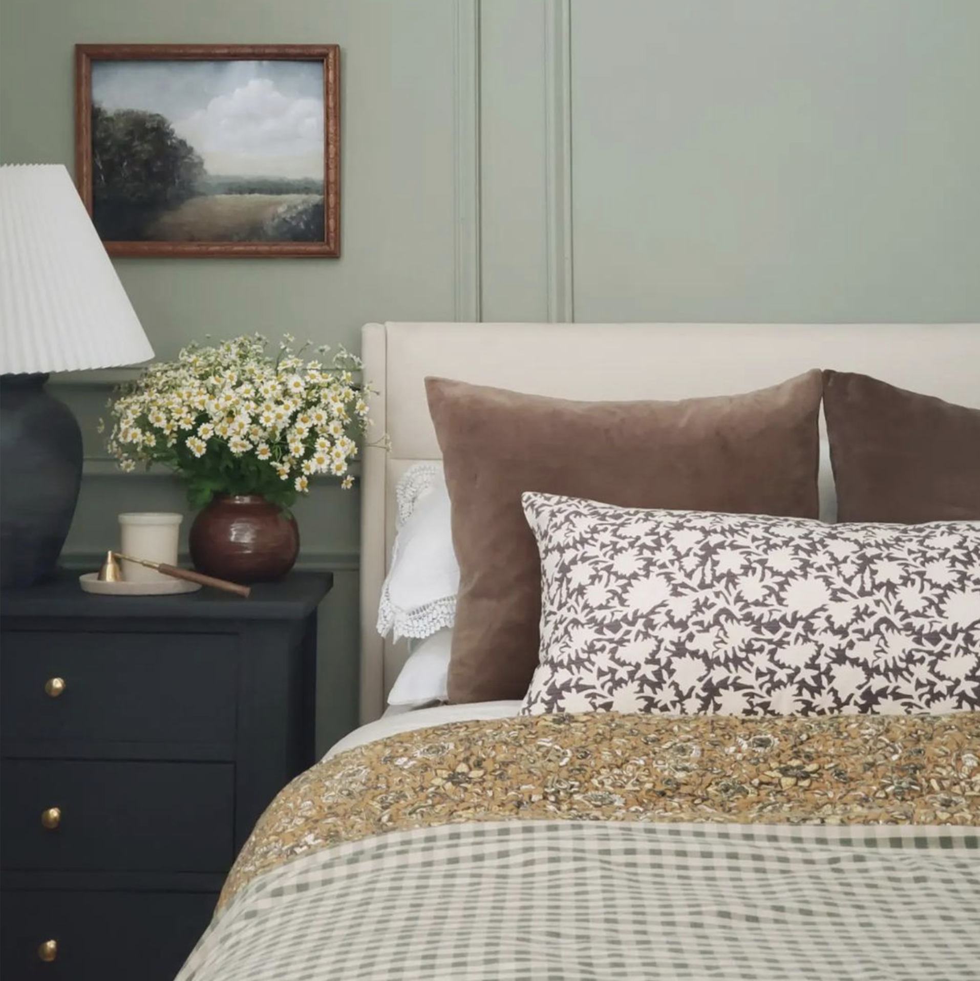
Color for me is always the element that sets the entire mood for a space when I begin an interior project anew. It dictates warmth, personality, and flow, and the emotional tone long before furniture or décor enter the conversation. Yet color is also the element that overwhelms clients the most. This is why I rely on a thoughtfully curated Laurel + Blush color swatch box, not to introduce something basic, but to elevate and streamline the design process in a way that brings clarity and confidence into every choice.
I've had the privilege of working every day with the clean, modern, and textural aesthetic that defines Laurel + Blush, and I've seen how intentional color selections transform a room. From custom palette design for homes across Texas to guiding clients in choosing textiles from our handmade collections, this curated swatch box helps ground decisions with ease and confidence.
Knowing how certain shades interact with texture, lighting, and material allows me to design with purpose. This is why a well-considered swatch box has become one of my most trusted tools in the design experience, because clients don't know what swatches are, but because ours is curated for clarity, cohesion, and the Laurel + Blush aesthetic.
Color holds both visual and emotional weight. It sets the trajectory of a space, anchors the palette, and guides every decision that follows. Even for the most seasoned clients, the challenge to visualize color in a home can be overwhelming, especially when relying solely on a digital preview or an online image.
Digital screens distort tones. Lighting shifts dramatically throughout the day. A color that feels subdued in the morning light can overwhelm at night. When clients are left uncertain, hesitation begins—and the magic of the design process starts to wear off.
Clarity comes with our swatch box. By giving the client real materials in real lighting, decisions become intuitive, not stressful. This process turns out to be smooth, well-grounded, and enjoyable.
Unlike the generic trade swatch kits available, the Laurel + Blush swatch box is a specially curated collection of fabrics and textures directly connected to our handmade designs. These textiles reflect the natural materials, soft textures, and timeless palettes that define our brand.
Inside the box, customers will find:
High-quality fabric swatches with real texture variation
True-to-life color groupings, preselected to work in harmony
Materials that show how tones shift under natural as well as artificial lighting
Combinations inspired by our handmade pillow collections
This isn't an explanation of what a swatch box is-it's an introduction to how our swatch box elevates the design process and enhances the client experience.
Helps me make color comparisons in real lighting
Texas homes can experience everything from bright morning light to subdued afternoon light, and color is greatly changed by lighting. Textiles that are held in the actual environment show undertones and nuances that no screen can capture.
I always encourage clients to move these swatches around their home, morning sun, afternoon brightness, and evening light; each tells a different story.
Allows me to experience texture and color together.
Texture is just as critical as color. A warm neutral linen feels completely different from a warm neutral boucle. And when I put textures and tones next to each other, I immediately get clarity on the direction a room wants to move.
Texture is the heartbeat of Laurel + Blush, and the swatch box brings that philosophy into every palette.
Saves Time and Supports Smooth Decision-Making
Instead of second-guessing several options for weeks, the preselected choices help to quickly narrow the palette. Clients feel supported, relaxed, and confident in their decisions.
Makes the Design Process More Enjoyable
There is simple joy in holding actual fabrics, seeing how they interact, and finding the combinations that feel right. That confidence and calm is one of my favorite parts of working directly with clients.
Start with a Primary Anchor Tone
I start with a primary hue that will set the tone of the entire space. This may be inspired by a Laurel + Blush textile or a natural, neutral tone that's timeless.
Layer Secondary Colors for Balance
From there, I build supporting colors that soften or deepen the palette. These are the quiet tones that harmonize with floors, furniture, and architectural elements.
Add Accent Colors for Personality
Accent tones add motion, expression, and personality. Often, clients find their preferred accent tone once they have viewed it adjacent to our textured fabrics.
Test Colors Throughout the Home
Every corner of a room discloses a different dimension. Testing swatches throughout the home, the clients avoid surprises and feel totally aligned before finalizing the palette.
Extending Our Signature Aesthetic
Our design philosophy-natural materials, modern textures, and grounded colors-translates directly into how we curate swatches, so every palette feels elevated and cohesive.
Hands-on Exploration with Clients
During consultations, clients handle the materials and layer combinations, exploring the tones with the guidance. This tactile engagement instills trust and excitement.
Building Mood Boards with Real Textures
Every mood board I create uses actual fabric swatches, never digital color substitutes. Since it all starts at the swatch box, which details authenticity and accuracy, it lays a clear foundation for your design.
Choose Curated, Not Overwhelming
The endless options create confusion. A collection curation keeps the palette focused and harmonious.
Quality Materials first.
Texture, weight, and craftsmanship count. Actual, superior fabrics bring clarity and help form lasting design decisions.
Consider Your Home's Natural Light
Natural light varies around Texas and affects how warm or cool neutral tones will look. Colors chosen based on natural lighting result in the most beautiful looks.
Once the palette has been set, everything starts to come together: furniture, art, textiles, and décor. The room becomes an integrated and thoughtful space that speaks to the client's individuality. This is the moment where clients fall in love with their home all over again. And it begins with confident color choices rooted in clarity, texture, and intention.
Design shouldn't be overwhelming. When color choices are simplified with a curated, designer-forward swatch box, the whole process becomes more enjoyable. To me, this tool is so much more than fabric samples; it's intention, it's guidance, it's the essence of Laurel + Blush. It helps me bring into being homes that feel warm, modern, and timeless. When you're ready to explore color with confidence, the moment you open the color swatch box will change your design experience.